Canontire
About
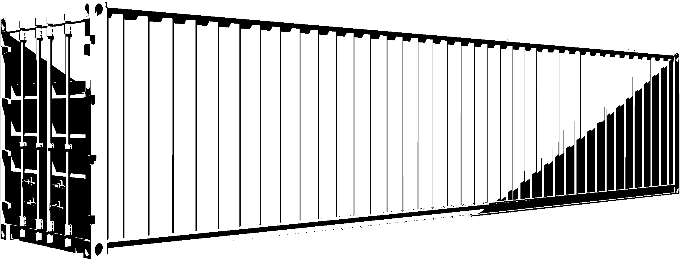
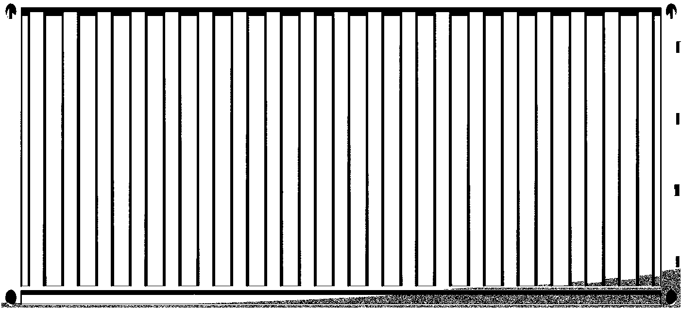
Canontire is inspired by the bulkiness of shipping containers and the bold lettering upon them. It tries to translate the heavy and blocky appearance with all the dents and rusty spots into something legible. Originally intended to be part of a corporate identity the typeface started to be a project on its own. One critical part of the design process was figuring out the right balance of roughness and smoothness. Not evening out too many of the crooked curves to keeping the typeface alive and maintaining its partly weired look. The family consists of the regular and bold weights.
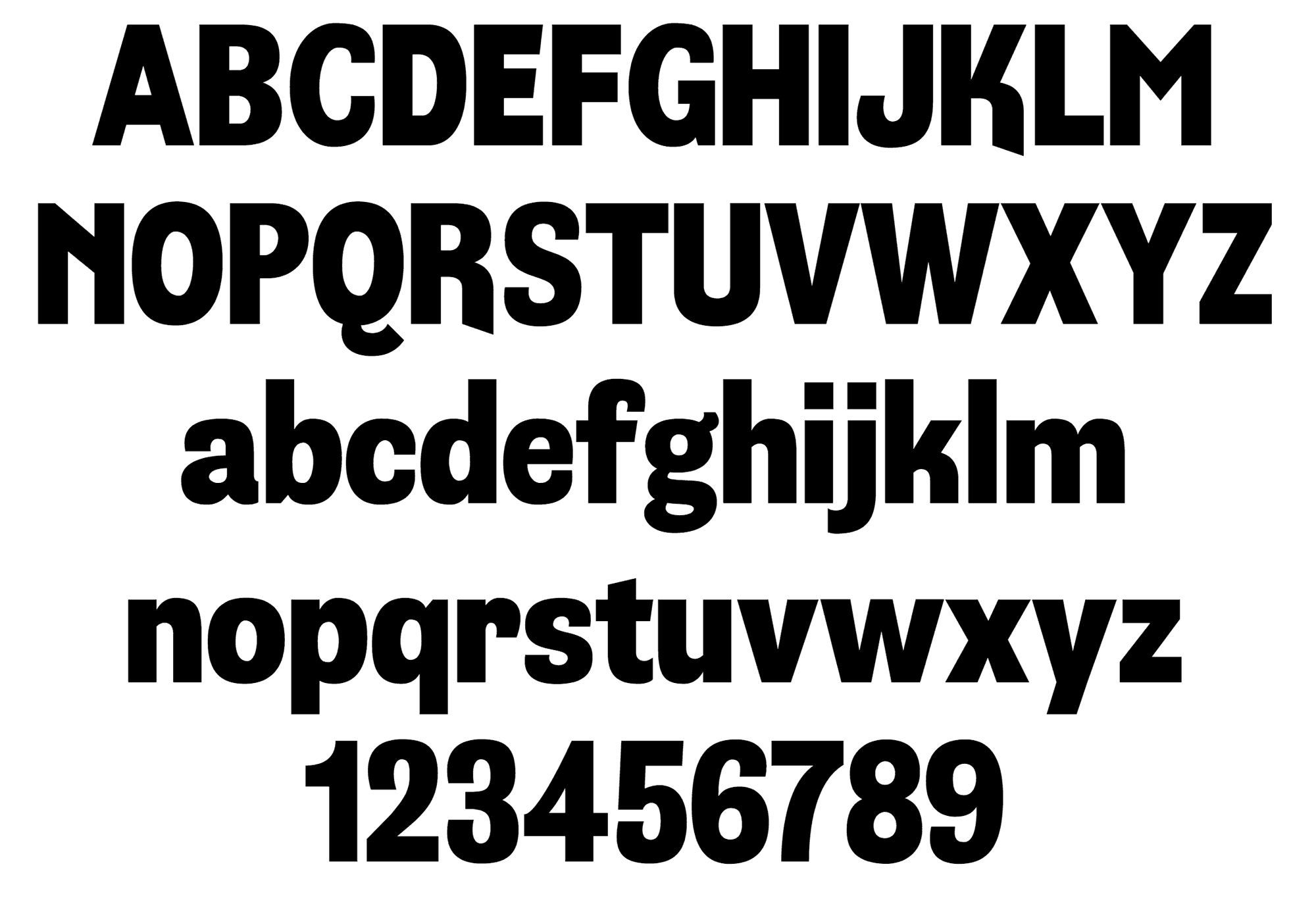
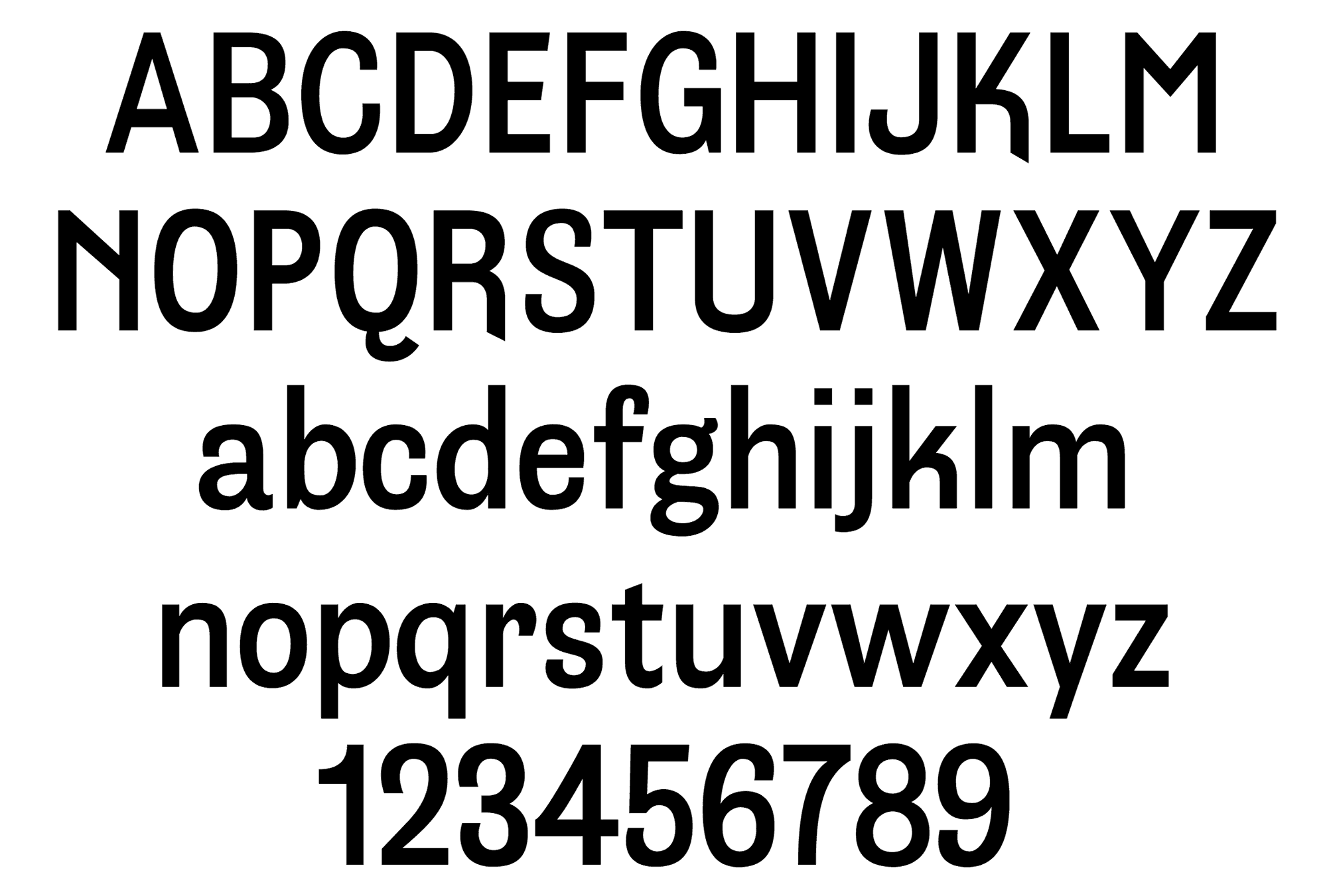
Basic character set


Font tester
Shipping
TRANSPORTATION