IKA typeface

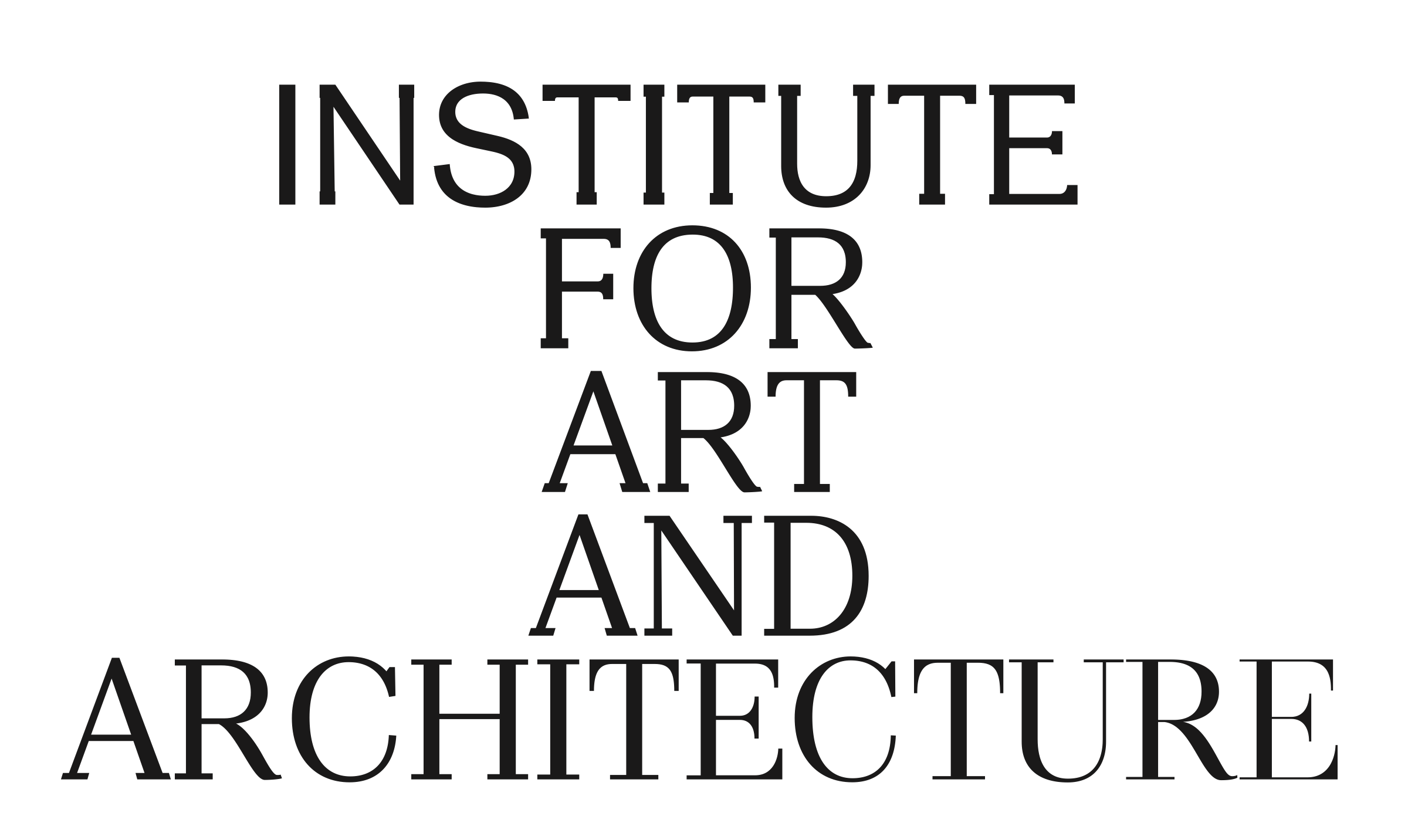
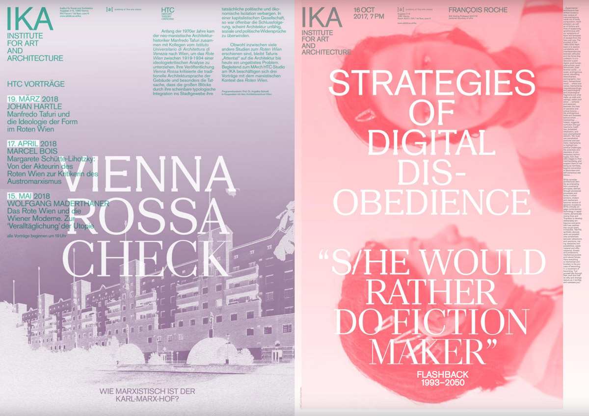
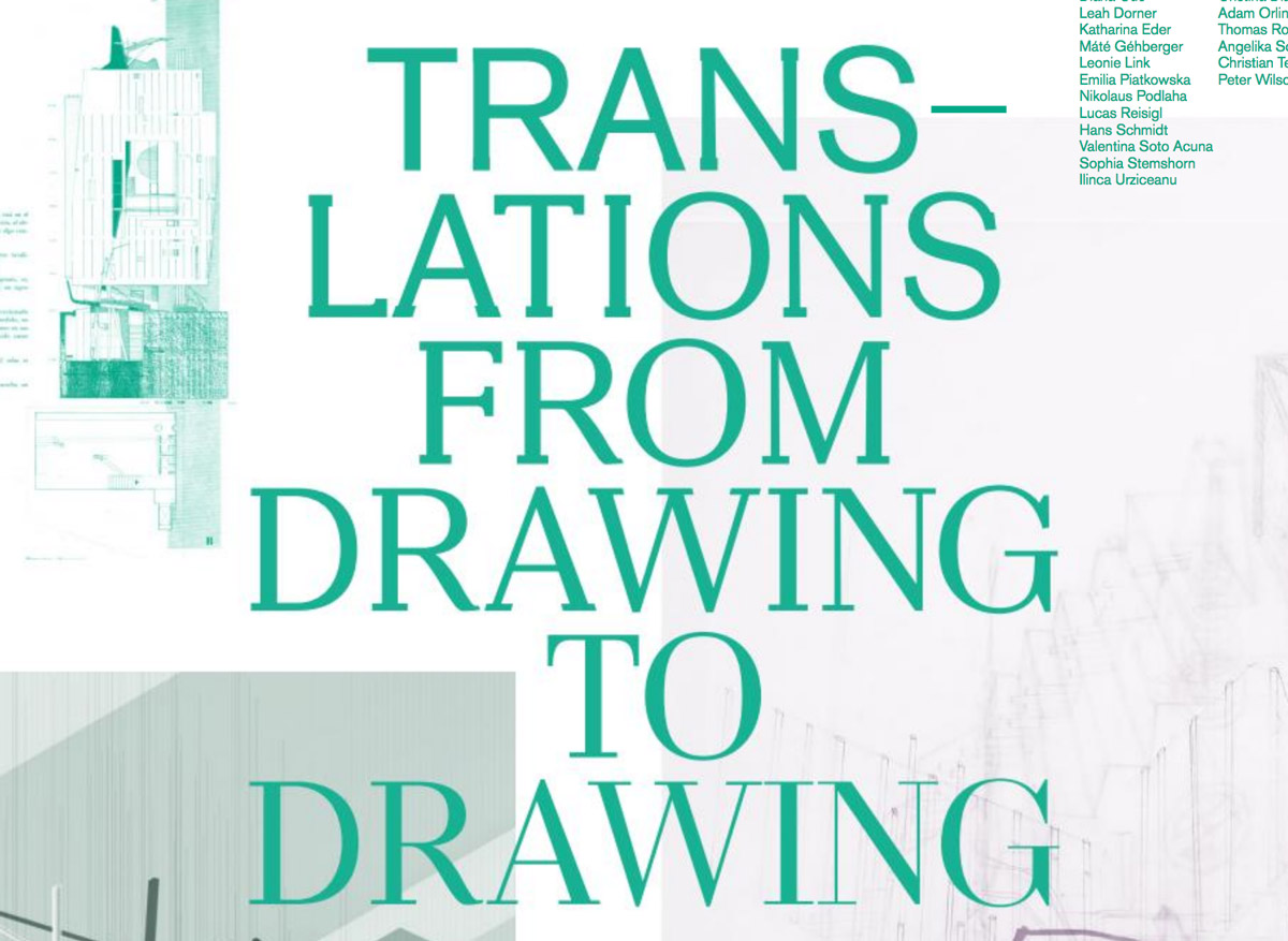
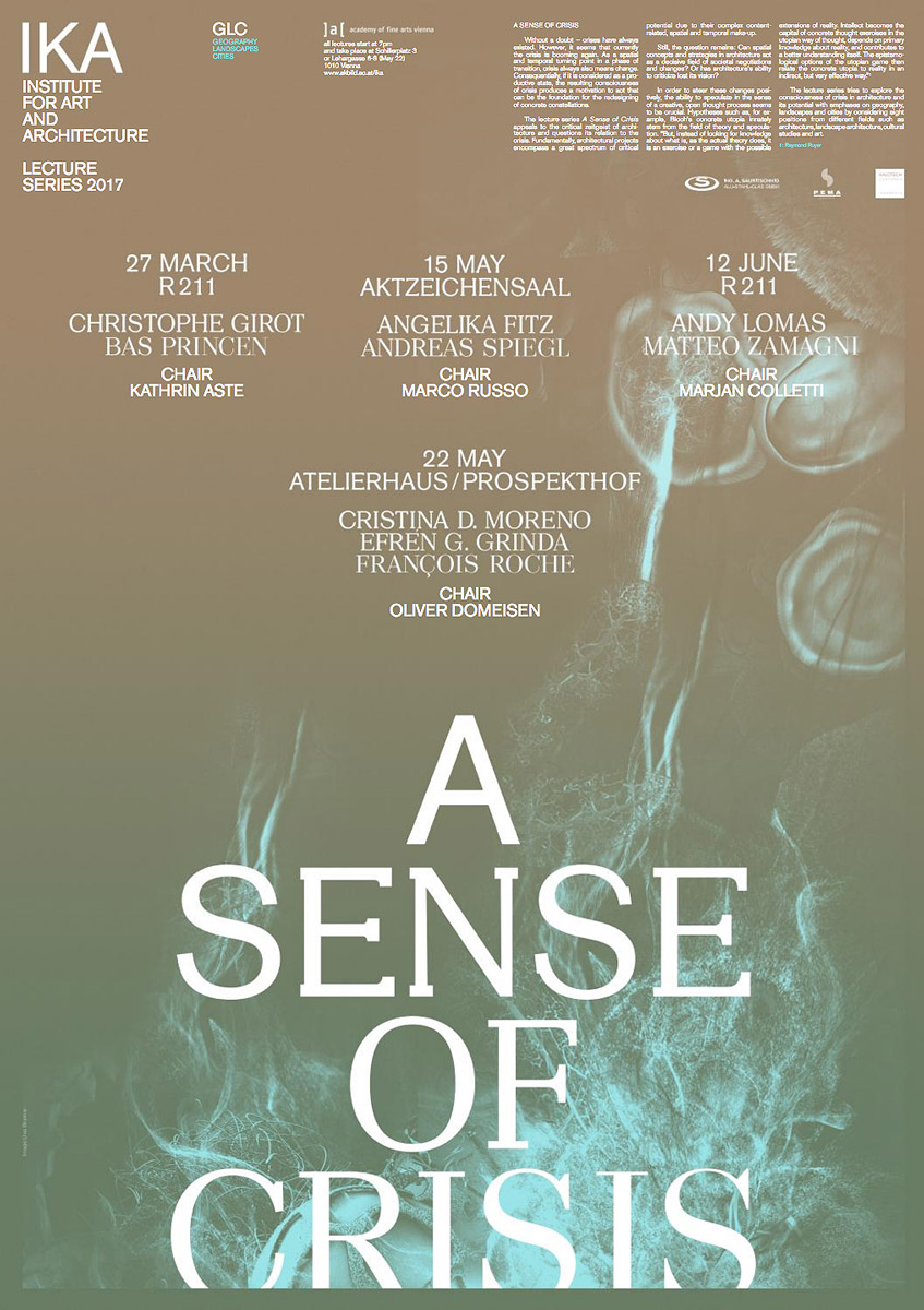
For printed matter the IKA (Institute for art and architecture) was looking for a typographic system that reflects their view of architecture. Within the headlines the typeface interpolates from first to last character – the two endpoints are a Grotesque on the start and a Modern high contrast typeface at the end. The amount of instances in between is defined by the length of the text. In collaboration with graphisches büro.

Printed in use

Designed by graphisches büro

Designed by graphisches büro

Designed by graphisches büro